Websites that work like apps: how we turned a therapy blog into a place to practice
Most websites still behave like brochures. Pages, pictures, a contact form. We recently finished a large update of the blog for a psychotherapy practice in New York and added 16 kinds of interactive tools to its articles. A reader no longer only learns about a skill. They try it right there, in the middle of the text. This is what we built, three tools in detail, and why we think every site will move this way.
From pages to a product
Software taught people to expect a response. They tap, something changes. A text that only describes an exercise asks the reader to remember it, close the tab and maybe try it later. Usually they don’t.
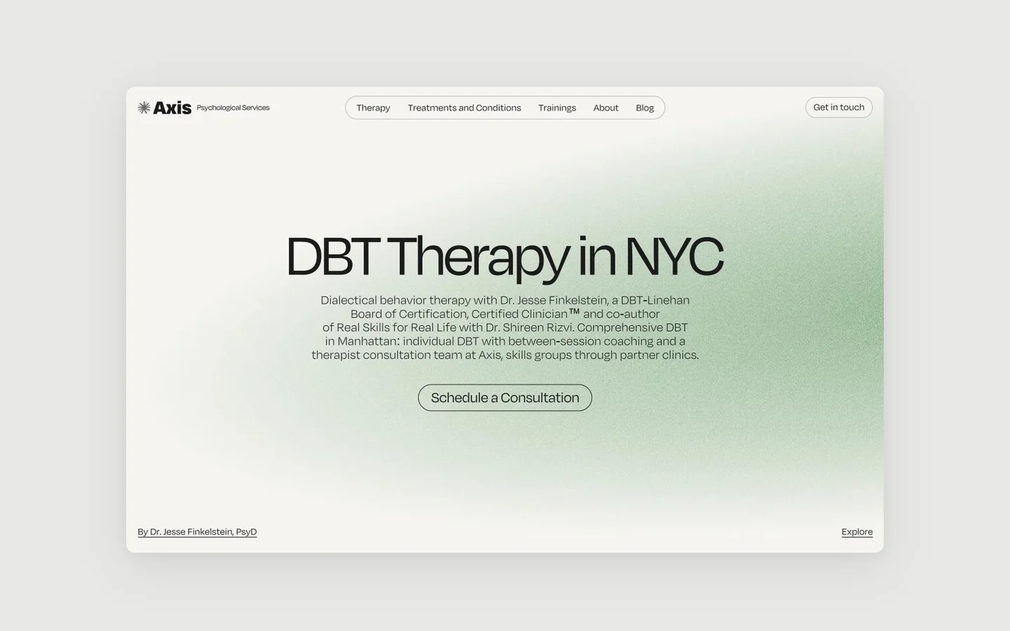
The practice is Axis Psychological Services, led by Dr. Jesse Finkelstein. Its blog explains DBT and CBT skills: breathing, tolerating distress, mindfulness, talking to people you love. Each of these is something you do, not something you read. So we treated each article as a small product with its own job.
Across about fifty articles there are now 16 kinds of interactive elements. Five of them, to give a sense of the range:
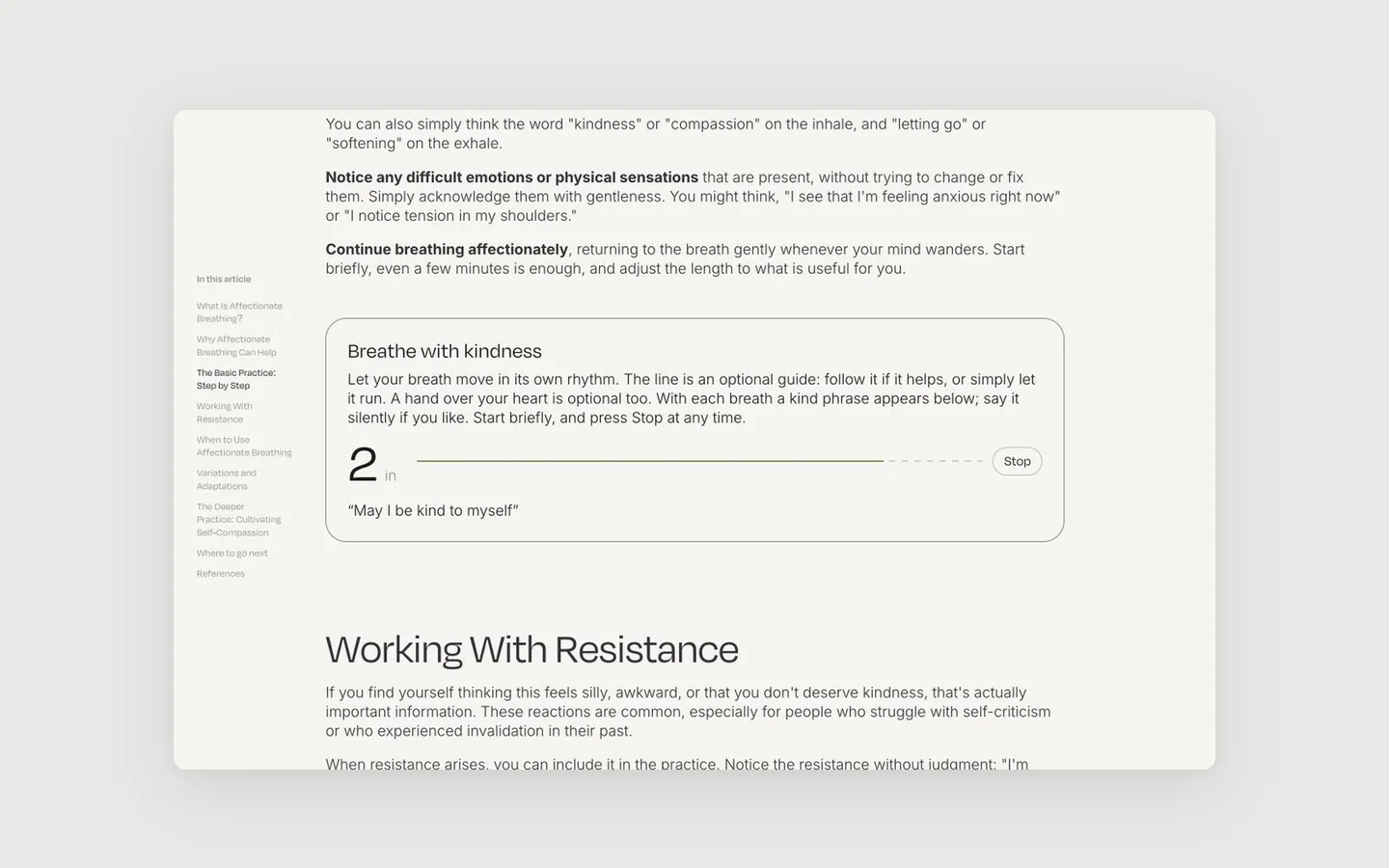
- Breathe with kindness. A breathing pacer with a line to follow, kind phrases and a soft sound.
- Your crisis pattern. Pick what you tend to do in a crisis and get a skill to start with.
- Pros and Cons worksheet. Fill it in on a calm day and keep it as a PDF on your phone.
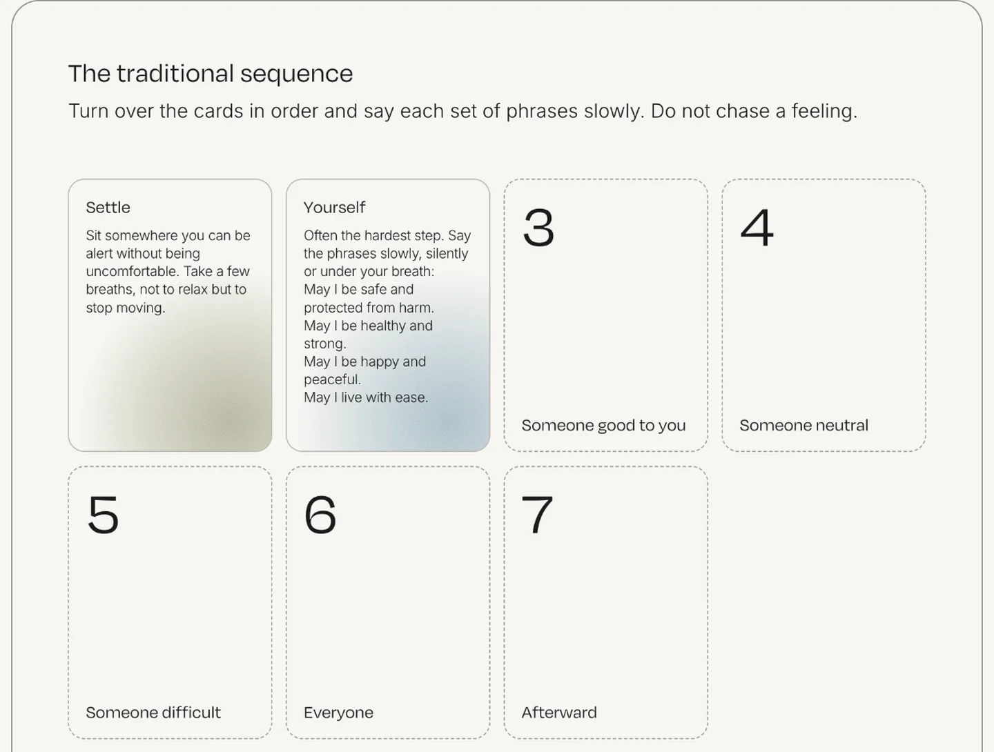
- The loving kindness sequence. Seven cards to turn over in order, one step at a time.
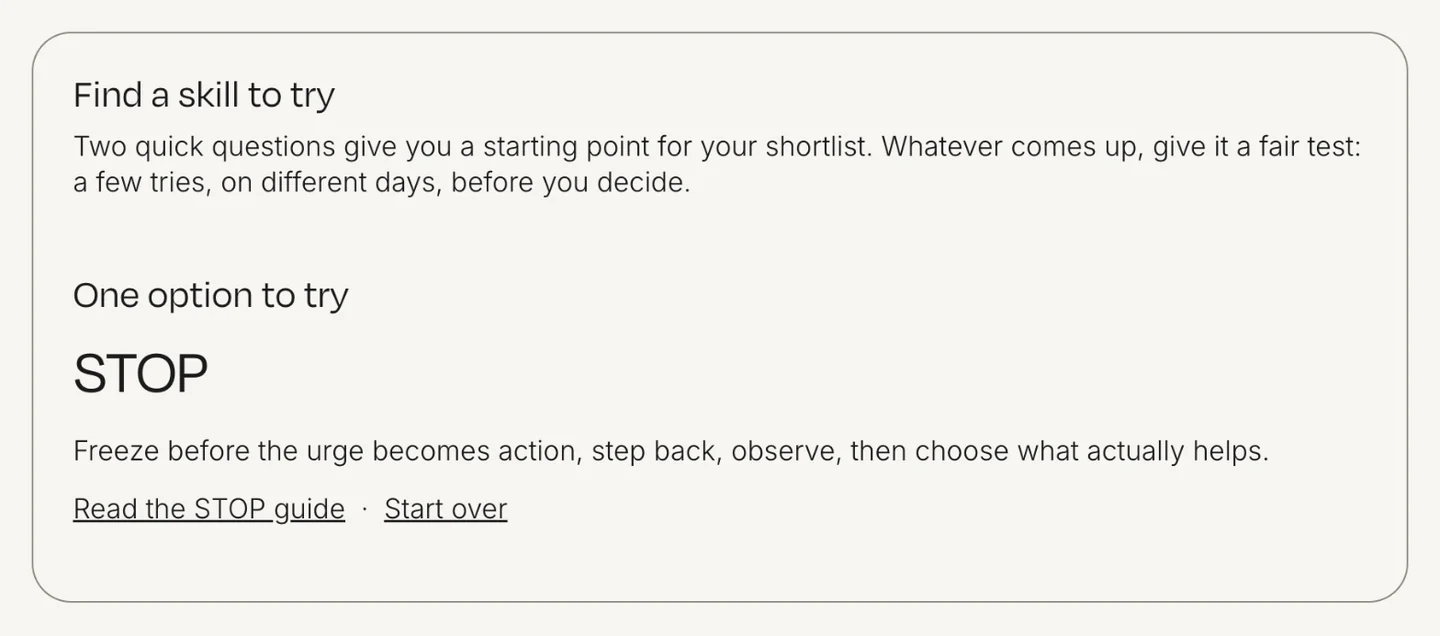
- Find a skill to try. Two quick questions lead to one skill and a link to its guide.
Breathe with kindness
The article on affectionate breathing describes a self compassion practice. Below the steps sits a pacer. Press Start, breathe in while the line fills and out while it empties. With each breath a kind phrase appears under the line: “May I be kind to myself”, “May I accept myself as I am”. The reader can practice for two, five or ten minutes and stop at any moment.
The pacer has sound. A soft breath follows the inhale and the exhale, and a quiet chime marks the end of the session, so the reader can close their eyes and still keep the rhythm. The sound is generated in the browser, with no audio files to download, so the page stays as light as before.
This is the point of the whole update. A person reads a recommendation and applies it the same minute. They understand the skill better because they have felt it, and for someone who opened the article in a hard moment, it is real help, not a promise of help.
Your crisis pattern
The article on distress tolerance lists many skills, and a list is hard to use when you are overwhelmed. So the article asks one question: what do you tend to do when a crisis hits? The reader picks everything that fits, from sending messages they regret to scrolling for hours, and each choice shows one skill to start with.
The tool is careful in tone. It says these are starting points, not the one correct answer, and that a therapist can help build a personal plan. Nothing the reader picks is saved or sent anywhere. Privacy is part of the design, not a line in the footer.
Pros and Cons worksheet
DBT asks people to weigh acting on an urge against resisting it, ideally before the urge arrives. On paper this is a worksheet a therapist hands out. In the article it is a form: the urge, the pros and cons of acting on it, the pros and cons of resisting.
One button turns the answers into a clean PDF in US Letter or A4, ready to save to a phone or print. The text stays in the reader’s own browser. The article becomes a tool people come back to, and a document they carry with them.
Two more from the set
Some tools are quieter. In the loving kindness article the traditional sequence is a row of cards. The reader turns them over in order and reads one set of phrases at a time, instead of facing a long block of text.
The guide to choosing a skill ends with a short finder. Two questions, how strong the emotion is and what the reader needs most, lead to one skill and a link to its full guide.
Why interactive content works
Search. People stay longer on a page they use, scroll to the tool, come back to it and share it. A useful tool also gives other sites a reason to link to the article, and links remain one of the strongest signals for search. Unlike plain text, a working tool is hard to copy and hard for an AI summary to replace, so the reader still has a reason to open the page.
Trust. A therapy practice asks people for something difficult: to reach out. A blog that helps before it asks shows how the clinician thinks and works. When the reader books a consultation, they already know the approach, because they have tried a piece of it.
Value before payment. Most marketing promises value. Interactive content delivers some of it right away. A person who calmed their breathing on a page, or left with a plan for a hard moment, has received real help for free. That is the strongest argument a service business can make.
Built like a product, light like a page
Each tool is a small piece of plain code inside the article. It loads with the page, works on a phone, keeps the brand’s typography and colors, and stores nothing on a server. The articles stay fast, and the content team keeps writing in the same editor as before.
The approach is not limited to therapy. A SaaS site can let visitors estimate their savings, a clinic can explain a procedure step by step, a studio can let clients compare packages. Any page that explains something people do can let them do it.
Websites as services
We believe websites will hold more and more interactive elements. Pages that engage people, not only inform them and show beautiful pictures. As a SaaS design and development studio, we approach every site this way, including marketing, presentation and corporate sites: a website as a service, with interaction built into the content.
If you want your site or blog to work like this, see how we approach web app development or tell us about your project.