Why every good website starts with a mood board
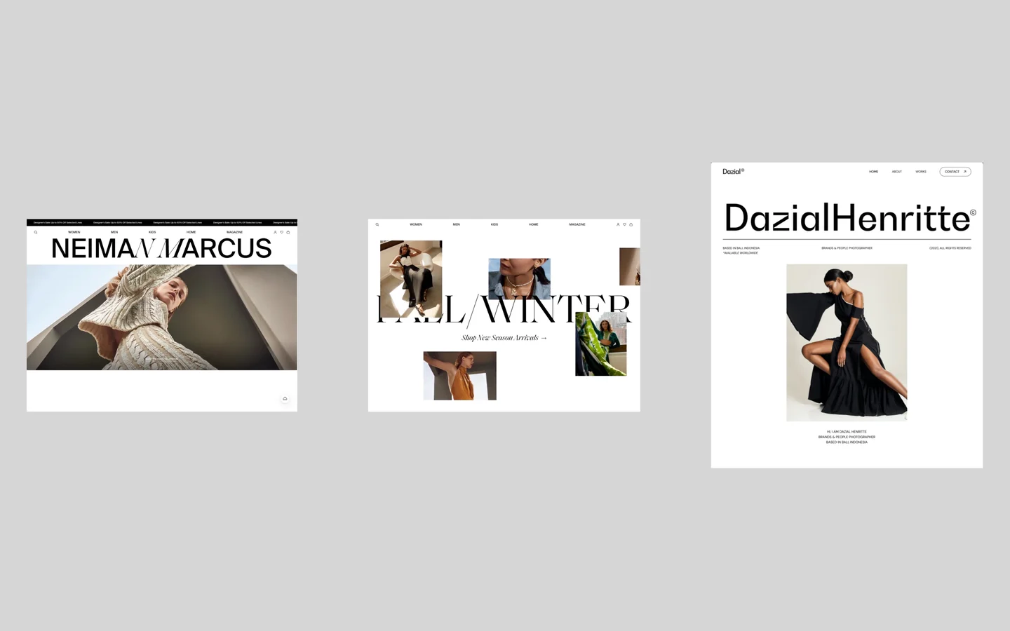
A mood board is the first thing I make on every website and SaaS project, before a single wireframe. It is a structured collection of references that shows what the market looks like today, what has gone stale, and where there is room for something new.
Most teams skip it because it feels like browsing. Done properly, it is research. It saves weeks of revisions later, because the client and the designer agree on direction before anyone draws a screen.
This article walks through how I build one: where I look, how I sort what I find, and how I use it to give a product a look people remember.
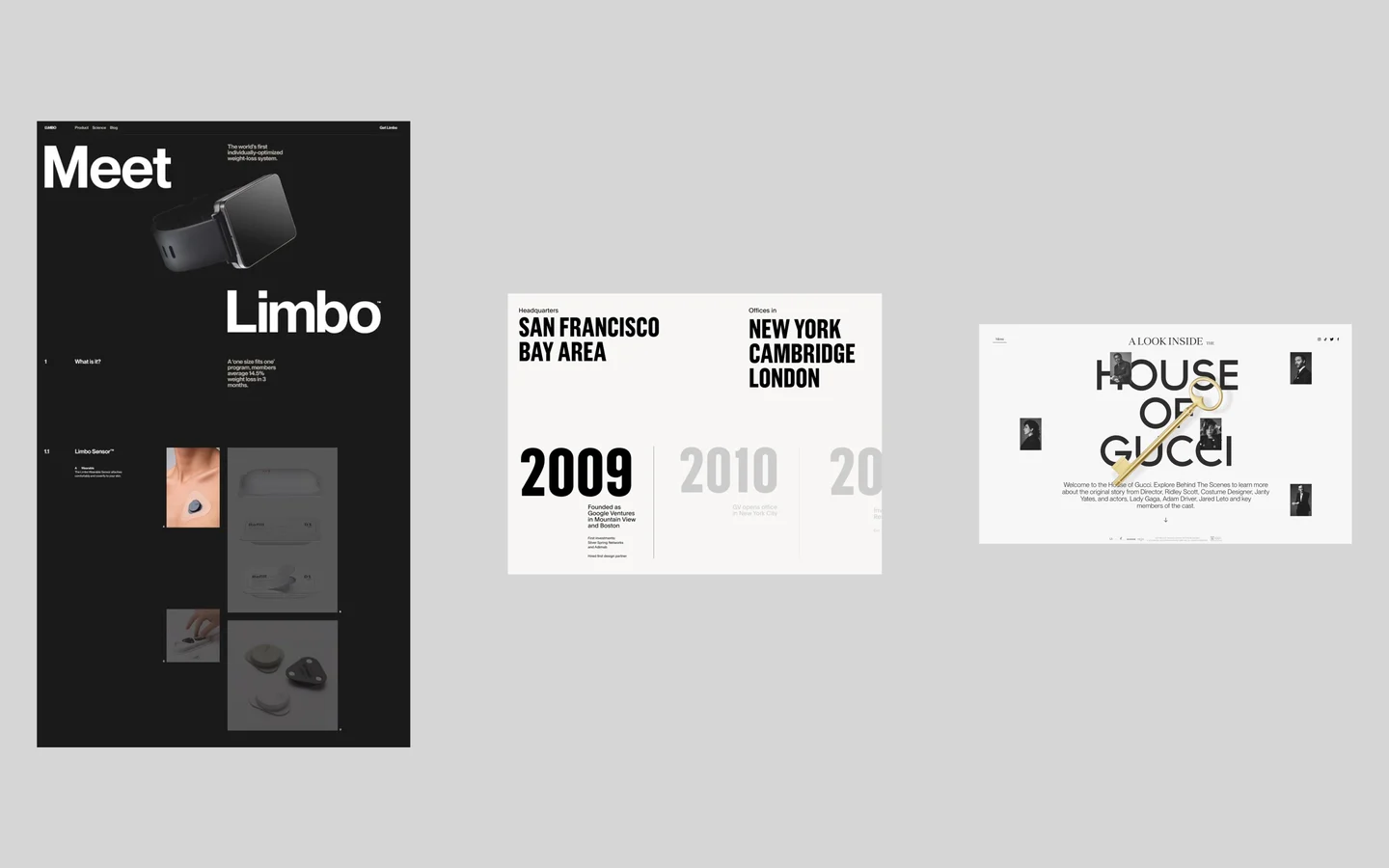
What a mood board gives you
A good mood board answers three questions about the market you are about to enter.
- What is current. Which layouts, type pairings, motion patterns and interactions the best products in the space use right now.
- What is tired. Which ideas have been repeated so often that users scroll past them. A hero animation everyone has seen ten times no longer earns attention.
- What is missing. The gap nobody in the niche has filled yet. This is where a design stops looking like its competitors and starts looking like a brand.
The third answer is the one that matters commercially. A store or a SaaS app that feels different is easier to remember, and a site people remember is a site they come back to.
Where to look
I pull references from six kinds of sources. Each one answers a different question.
- Award galleries. The current ceiling of web design, judged by a jury of designers and developers. Awwwards, CSS Design Awards, The FWA.
- The client’s competitors. What the niche already does well, and what its customers are used to. Start with the client’s own list, then the top results for their main search terms.
- Brands the client admires. The taste and ambition the client is aiming for. Ask for three to five names in the kickoff call.
- Curated galleries. Proven patterns for landing pages, product UI and flows. Land-book, Lapa Ninja, SaaS Landing Page, Mobbin, Godly, SiteInspire.
- Adjacent niches. Ideas the client’s customers see elsewhere, not yet used in this market. Look at industries that share the same audience.
- Visual platforms. Type, color, photography and art direction. Behance, Dribbble, Pinterest, Savee, Cosmos, Are.na.
Start with award galleries to calibrate quality, then narrow down to the niche. Adjacent niches are the most underused source. A fintech product can borrow calm from a wellness brand. A clinic site can borrow clarity from a premium hotel.
Collect it in Figma, then decide
Everything goes onto one Figma page, grouped by theme: layout, typography, color, imagery, motion, interactions. Screenshots alone are not enough. I record short screen captures of animations and transitions, because motion is often what makes a reference worth keeping.
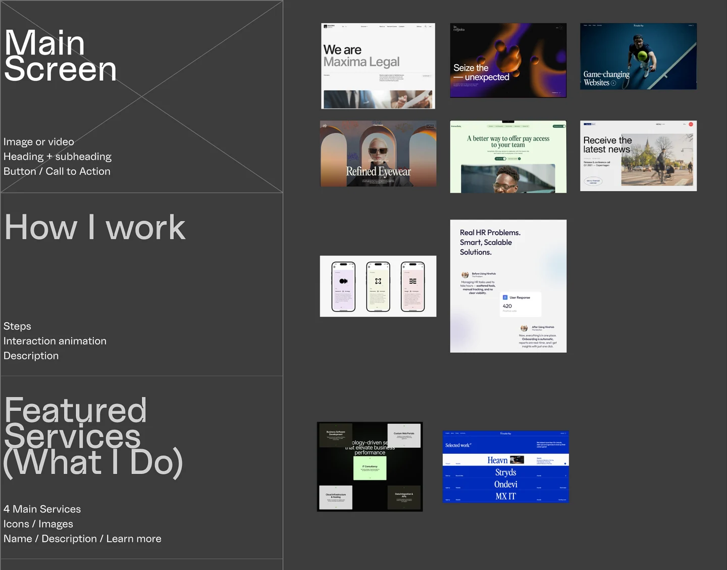
Then comes the part that turns a collection into a strategy. For every group I decide what to use, what to drop, and why.
- Keep patterns that solve a real problem for the client’s users and still feel fresh.
- Rework good ideas that have been used too often. Take the mechanic, change the form.
- Drop anything that is decoration without purpose, or that every competitor already has.
A useful test: if you have seen the same trigger, animation or layout on five sites this month, users have seen it too. It will not make anyone remember the product. Change it until it feels like yours.
I write one line of reasoning next to each decision. When the client asks why the site looks the way it does, the answer is already on the board.
Find the gap
Once the board is sorted, the empty spaces become visible. Maybe every competitor uses the same cold blue and stock photography. Maybe nobody in the niche uses motion to explain the product. Maybe all the pricing pages look identical.
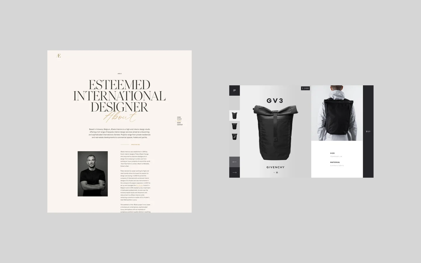
That gap is the brief for the design. Before committing to it, I check two things:
- Is it relevant? A new idea has to serve the client’s customers, not only look interesting in a portfolio.
- Does it hold up next to the best? Put the concept beside the strongest competitors on the board. If it looks confident there, it will look confident in the market.
This is also where the mood board pays for itself emotionally. When you have seen the whole market, you stop guessing. You know the design is fresh because you checked, and you know it will not look out of place next to the leaders.
When to make one
Always, if the project is a new product, a redesign, or a brand entering a crowded market. It matters most when the client has no clear visual idea yet, or when you want to understand a niche deeply before you commit.
A small update to an existing site with a mature design system can skip it. Everything else benefits.
Checklist
- Collect 20 to 40 references from award galleries to set the quality bar.
- Add the client’s top five competitors and three brands they admire.
- Add at least five references from adjacent niches.
- Record screen captures of any motion worth keeping.
- Group everything in Figma by layout, type, color, imagery, motion, interaction.
- Mark each group: keep, rework or drop, with one line of reasoning.
- Name the gap in one sentence.
- Place your first concept next to the strongest competitor and compare.
- Walk the client through the board before any wireframes.
Tools for building the board
- Figma: my default. The board lives next to the design files, so references flow straight into wireframes.
- FigJam: good for running the board live with the client and collecting their reactions as sticky notes.
- Milanote: a lighter option for teams that do not work in Figma.
- Savee and Cosmos: for saving references as you browse during the week, then moving the best ones into Figma.
Start your next project with research
A mood board is a few days of work that sets the direction for months. If you are planning a new website or SaaS product and want it to stand out in its market, tell us about your project and we will look at your niche together.