Building the Aimgod iPhone app with Claude
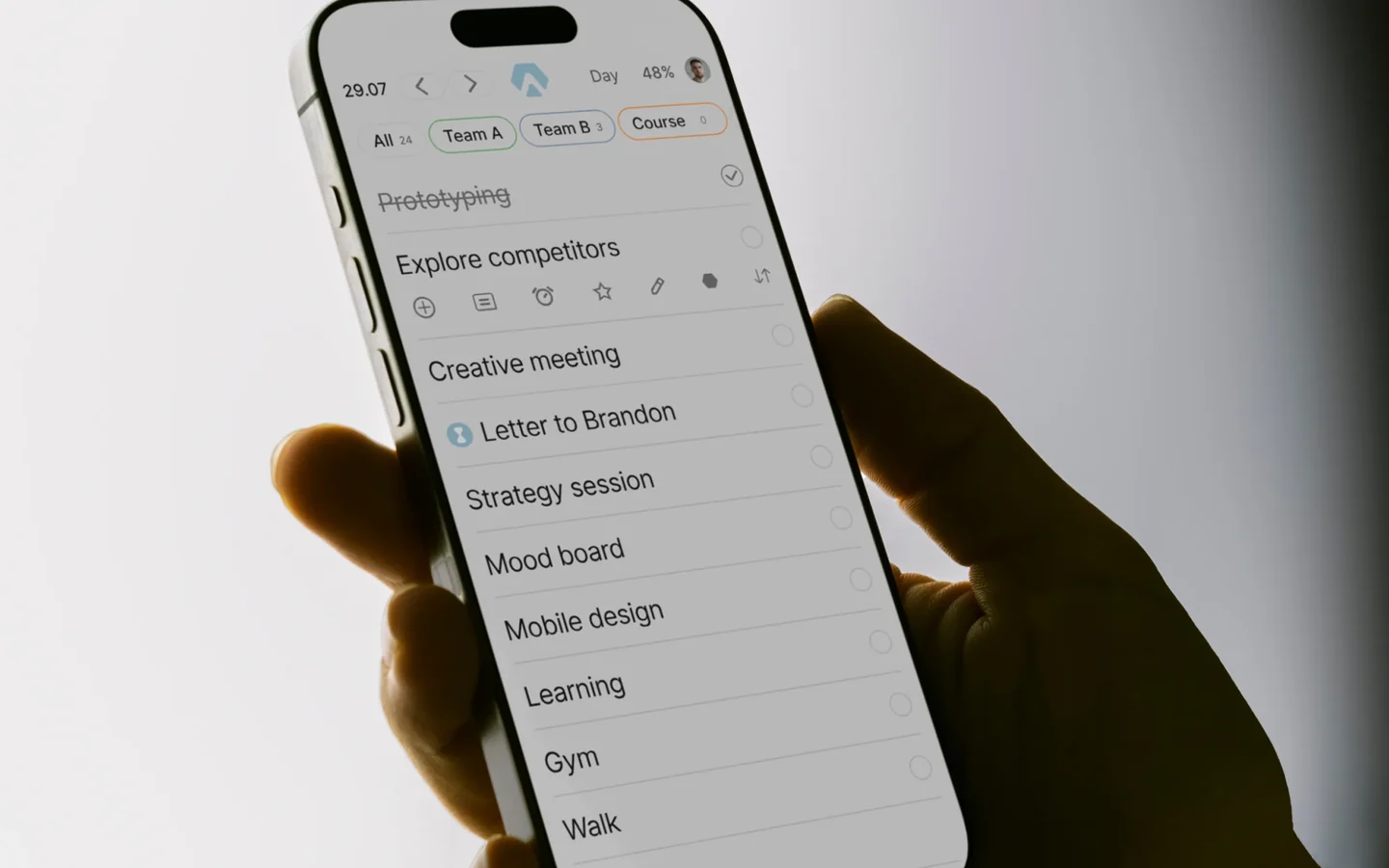
Aimgod is my own product, a calm day planner I have used every day for years. In early October we built its native iPhone app: ten TestFlight builds in four days, written in SwiftUI with Claude Code, tested on my own phone. This is how the work was split, how I direct Claude, what the AI watched for and what went wrong.
Why native, and why now
The Aimgod web app already worked on the phone, and it could be installed from the browser. Then a tester told me something I could not argue with: a planner that lives in a browser tab feels less serious than an app. For something as personal as your day, trust matters. I also noticed that I use Aimgod about 80% of the time on my iPhone.
So we skipped the wrapper and went straight to SwiftUI. A web view inside an app shell would have shipped faster, but it would never feel like it belongs on the phone, and it would not give us widgets, Live Activities in the Dynamic Island or real haptics.
How the work is split
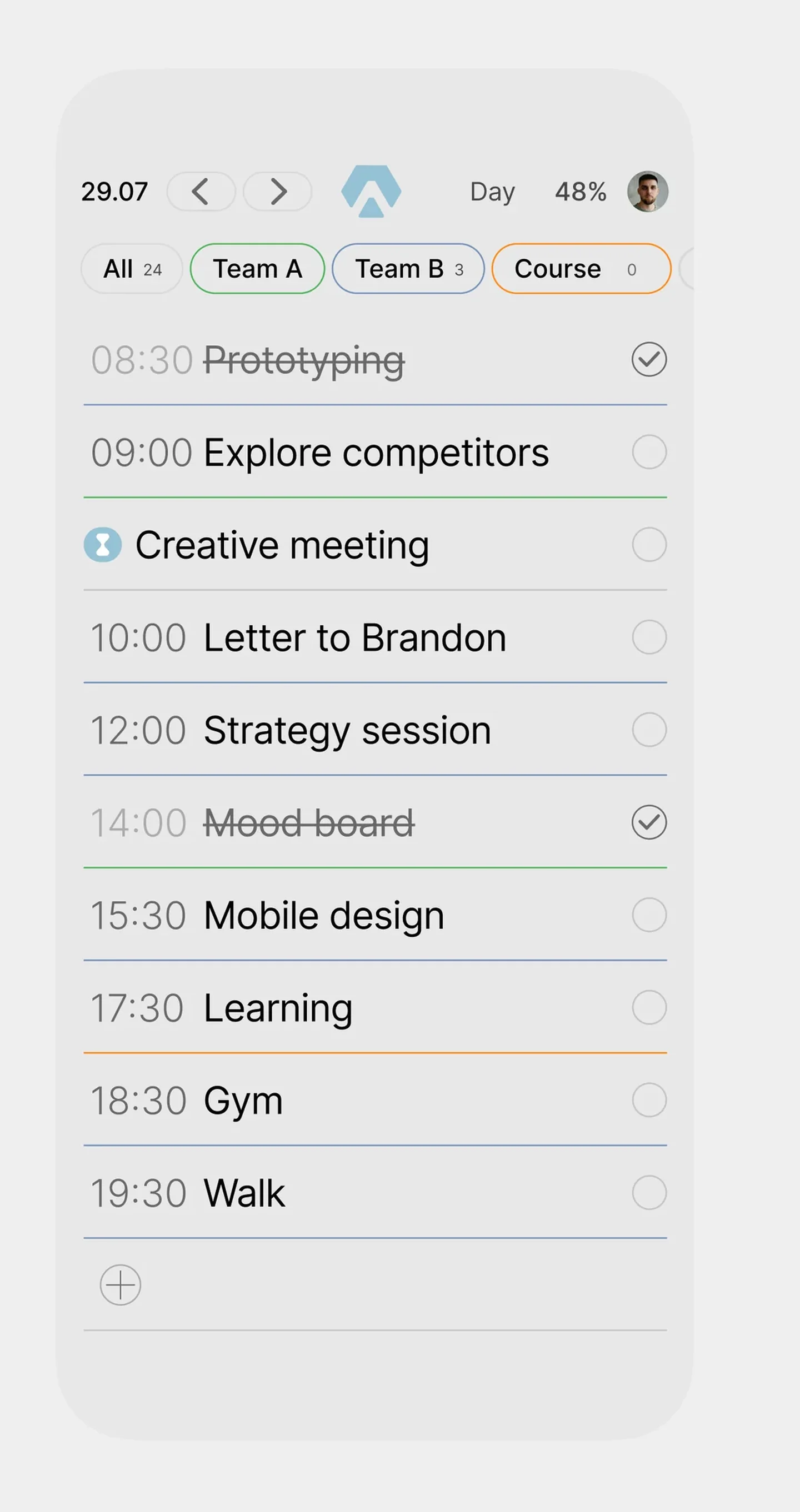
Roughly 70% of the work is still craft: the product idea, the flows, the interface, the motion, the decisions about what goes into the first version and what waits. That part comes from me and from the design system I built in Figma.
The other 30% is where AI changes the economics. Claude Code writes the Swift, keeps the iOS app in sync with the web app, systematizes tokens and specs, writes the tests and uploads the builds. I do not write Swift by hand. I describe, review and test.
The setup is simple. Xcode runs on a Mac mini and is connected to Claude Code through MCP, so Claude can build, run the simulator and read errors itself. The web app is the source of truth: a parity spec lists every screen, state and animation of the mobile web version, and the native app has to match it before it gets anything new.
How I work with Claude day to day
Everything starts from the design system. Either it already exists, or there is a design file, and we turn it into a system first: tokens, type, colours, components, states. Only then do screens and pages get assembled from it, in the app and on the site. That is why the result looks designed and not generated.
I run the work from two places at once. On the computer I watch the build, the simulator or the page. On the phone I give commands by voice, check the result on a real device and send the next correction while Claude is still working on the previous one. Most of my instructions are spoken, short and visual: move this, make that lighter, this animation stops too abruptly.
The corrections are mine, and this is the main difference from AI building something from a prompt. A model can produce a screen that works. It cannot tell that the arrow in a pill looks off centre, that a grey is one step too light for small text, or that a transition feels nervous. That takes a trained eye, and the eye stays with the designer.
Everything else that can be automated, is: builds, uploads to TestFlight, tests, screenshots, guideline checks, the project log. My main tools stay the same as before, Figma, Adobe After Effects and Webflow, with Artlist for AI video backgrounds in my work. Claude sits on top of them and removes the routine.
What Claude watched for
Parity with the web. Every animation has a written curve and duration. Subtasks open in 600 ms on the same curve as on the web, a closing time pill folds to the right, not to the centre. Claude records the web version at 390 px and the simulator, cuts both into frames and compares start, direction, anchor and end state.
Apple’s rules before Apple’s reviewers. Before we submitted anything, the build was checked against the App Store Review Guidelines that most often cause rejections:
- the AI assistant shows a consent screen before the first request, with a link to the privacy policy, and consent can be withdrawn in Settings;
- a subscription sold on the website can only appear in the app if it can also be bought there through in app purchase, so version 2.0 ships with free features only and Premium comes with in app purchase in 2.1;
- no placeholders for features that are not ready, because reviewers reject “coming soon” screens;
- account deletion works inside the app, including revoking the Sign in with Apple token.
Accessibility. An automated audit on every main screen, the largest Dynamic Type size, VoiceOver labels, Reduce Motion, contrast in both themes and tap targets of at least 44 points. A few small grey texts and quiet links failed and were fixed.
Robustness. Airplane mode and sync without duplicates, a slow network, the app killed in the middle of a sync, a day with forty tasks, a time zone change at midnight.
How I test
I am the target user, so I am also tester number one. Every build lands in TestFlight and goes straight onto my iPhone. I plan my real day in it and write down everything that feels wrong, in plain words: “the subtasks jump when I tap fast”, “the time blinks when the pill closes”. Each note becomes a numbered item in a bug list, gets a regression check and is closed in a named build. Then I install the next build and look at exactly the items that were fixed.
Unit tests did not catch a single one of my animation notes. That is why the frame comparison exists, and why every interaction is run three times in a row: most of the bugs only appeared on the second or third try.
The hard parts
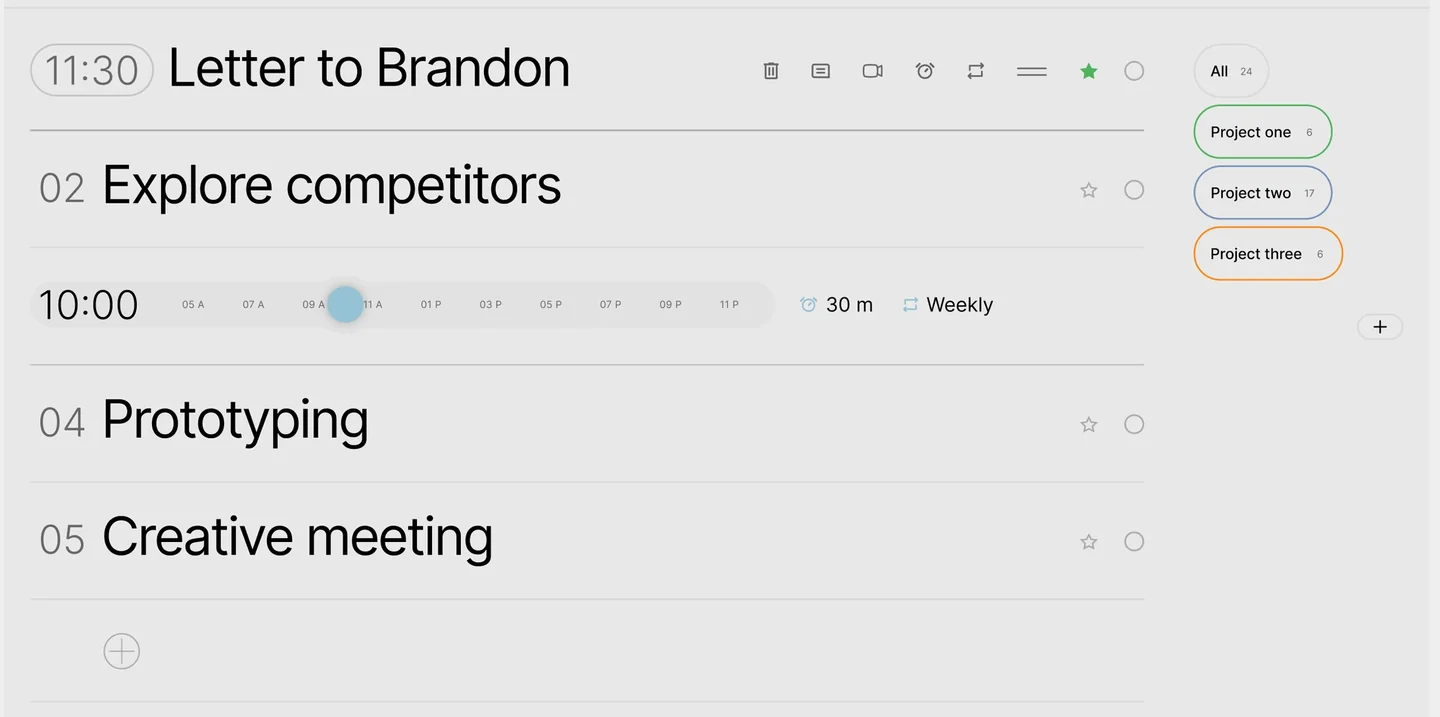
Animations that break on repeat. Subtasks expanded smoothly the first time and jumped every other time when tapped faster than once a second. The cause was a delayed callback fighting the next tap. The fix was one source of truth for open or closed, animated from wherever the rows are at that moment.
A timer nobody understood. The first Live Activity showed a running count in the Dynamic Island, in a serif font. The widget extension cannot see the app’s fonts, so it fell back to the system serif. Now the island shows the Aimgod mark, the time left of the current task as a countdown, and a Done button that works without opening the app.
A font detail. Inter, the font of the whole app, keeps a serif on its tabular digit one no matter which font feature you switch on. In the Live Activity timer, where the digits must not jump, we use the system font for numbers only.
Small phones. On the iPhone SE the page scrolled by 110 points in a single frame when subtasks opened. Fine on a Pro, broken on the smallest supported phone. Every check now runs on both sizes.
Voice input. The AI assistant crashed on dictation because the speech permission callback arrived on a background thread, which Swift 6 does not forgive. Caught and fixed before the review build.
The signature details
Some things only make sense on a phone. When you complete a task, a custom haptic pattern plays in sync with the animation: a soft tap when your finger presses the ring, a crisp double tap when the tick lands, and a short rising one when the last task of the day is done. Times in the Dynamic Island and on the Lock Screen follow Apple’s format, inside the app they follow ours. Swiping between days moves only the tasks, the header stays still.
What it took
Four days from an empty Xcode project to a review candidate. A day screen with a time ruler, spheres, subtasks and descriptions, sign in with Apple and Google, sync with the web app in real time, reminders with a Done action, widgets, a Live Activity, an AI assistant with dictation, a weekly productivity dashboard, App Store screenshots and a demo account for the reviewers. Toward the end, Claude was also uploading the builds to TestFlight by itself.
AI did not design this app, and it did not decide what goes into it. It removed the distance between a decision and a working build. That is the part that used to take a team months, and it is the part we now bring to client projects.